Logo
The first time Chris (CEO, co-founder) and I discussed creating an application that could “gamify” chores, we settled on ChoreMonster as a placeholder name until we found something we liked better. The very first logo I created has changed very little, other than simplifying shapes, balancing letters, and improving readability. The goal of the logo was to create a fun, playful mark that focused on kids.


When you create a logo it’s easy to overlook the various situations in which the logo will be used. It’s important to create variations on colored backgrounds of deepening tones. Why is this important? Because you really don’t want someone else taking a low-resolution version of your logo they found on Google, then sloppily “outlining” it and putting it onto their blog post at an unreasonably large size that makes it look like it’s been smeared with grease and run over by a Zamboni.

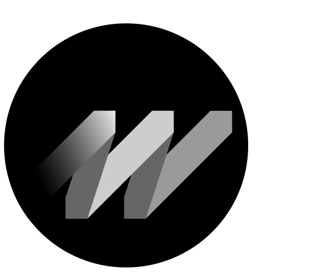
It's always worth creating the “meatball” logo; the mark that simplifies your logo and brand into a small, self-contained, even format that is useable as a type of watermark for situations when your full logo is ineffective. Truth be told, Monster Energy told us (aka threatened legal action) we couldn’t use this “M” because they own the letter “M” or something to that effective. So, thanks Monster Energy “Drink”.
Color Palette
Initially I envisioned the environment of ChoreMonster to be an actual world (for the kids version of the app), giving the monsters a place to dwell. Over time that focus shifted but the color palette was robust and varied enough to keep.


Sometimes you pick a typeface and begin to loathe it's very existence. You begin to see it being used everywhere. And it becomes like that jacket you have that you never wear because one time you saw a 63 year old man who was yelling at a tree on the sidewalk wearing the exact same jacket.